Recently I came across raincloud plots which I think are a really nice alternative to the standard boxplot. One of the primary issues with the boxplot is that it can mask the shape of your data. This can be especially pernicious when you have, for example, a bimodal distribution that does not appear on a boxplot.
The raincloud plot is a combination of (1) a boxplot, (2) the raw data, and (3) a overview of the distribution of the data. There already exists a package to easily create raincloud plots here but I wanted to take a stab and making one myself with the base matplotlib library.
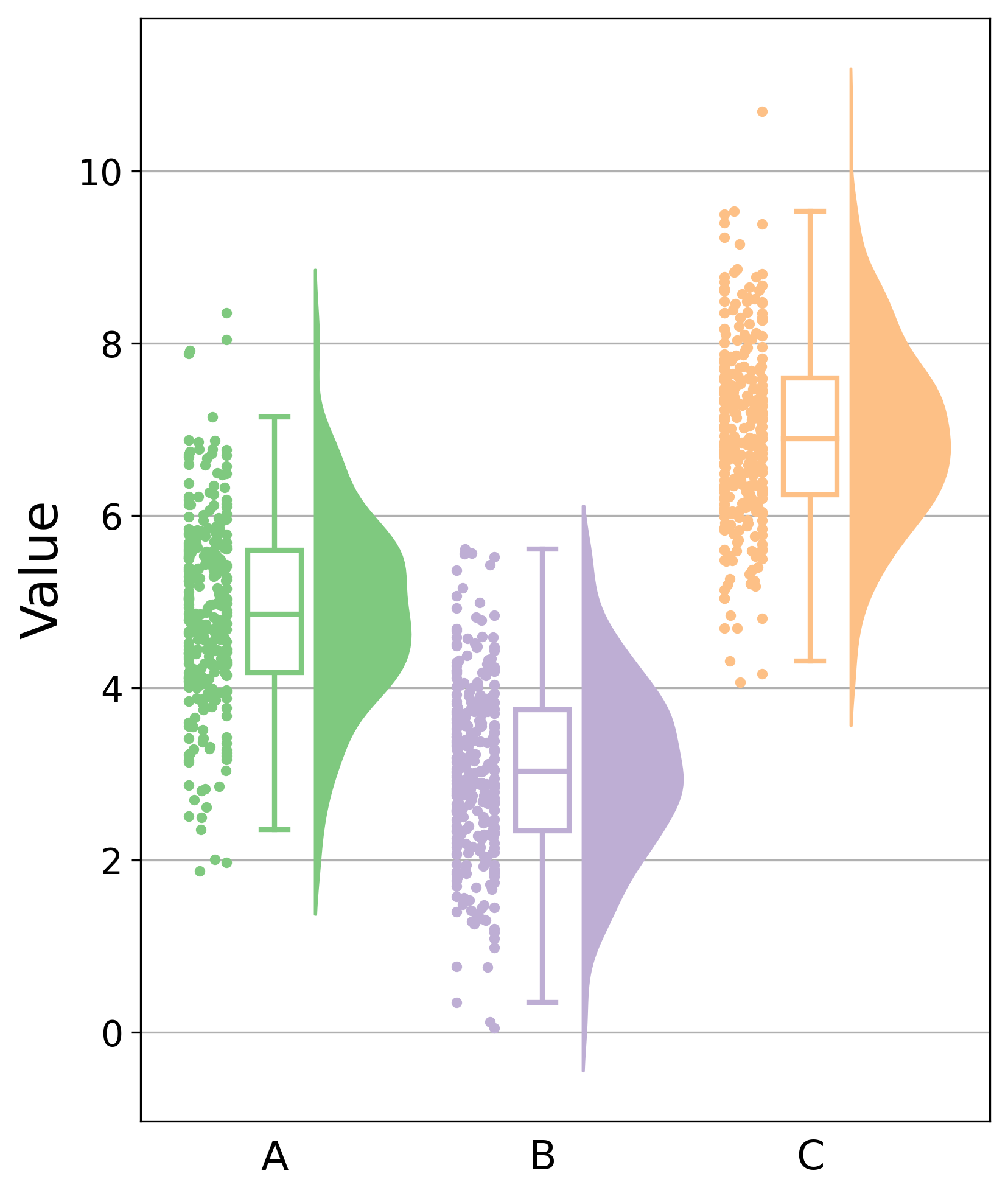
import matplotlib.pyplot as plt
import numpy as np
import scipy.stats as ss

# Generate random data
n = 300
rng = np.random.default_rng()
group_a = rng.normal(loc=5, scale=1.0, size=n)
group_b = rng.normal(loc=3, scale=1.0, size=n)
group_c = rng.normal(loc=7, scale=1.0, size=n)

fig, ax = plt.subplots(1, 1, figsize=(6, 8), facecolor="white")

vals = [group_a, group_b, group_c]
colors = ["#7fc97f", "#beaed4", "#fdc086"]

for i, (val, color) in enumerate(zip(vals, colors)):
    # Assign properties for each of the boxplots
    boxprops = {"facecolor": "white", "linewidth": 2, "edgecolor": color}
    medianprops = {"color": color, "linewidth": 2}
    whiskerprops = {"color": color, "linewidth": 2}
    capprops = {"color": color, "linewidth": 2}
    flierprops = {"marker": "d", "markerfacecolor": "black"}

    bp = ax.boxplot(
        val,
        positions=[i],
        patch_artist=True,
        boxprops=boxprops,
        medianprops=medianprops,
        capprops=capprops,
        whiskerprops=whiskerprops,
        showfliers=False,
        widths=0.2,
    )

    # Create jittered points to appear to the left of boxplots
    rng = np.random.default_rng(42)
    x_jitter = rng.normal(i-0.25, 0.1, len(val))
    x_jitter = np.clip(
        x_jitter,
        a_min=i-0.25-0.07,
        a_max=i-0.25+0.07
    )

    ax.scatter(
        x_jitter,
        val,
        color=color,
        s=10
    )

    # Create KDE of values and plot as filled-in curve to the right of boxplots
    min_val, max_val = val.min(), val.max()
    kde_range = np.linspace(min_val-0.5, max_val+0.5, 100)
    kernel = ss.gaussian_kde(val)
    kde_values = kernel(kde_range)

    ax.fill_betweenx(
        y=kde_range,
        x1=i + 0.15,
        x2=[x + i + 0.15 for x in kde_values],
        color=color
    )

ax.grid(axis="y", zorder=0)
ax.set_axisbelow(True)

ax.set_xticklabels(["A", "B", "C"], fontsize=16)
ax.tick_params("x", bottom=False)
ax.tick_params("y", labelsize=14)

ax.set_ylabel("Value", fontsize=20)

plt.savefig("custom_raincloud_plot.png", dpi=300, bbox_inches="tight")
plt.show()